T-Mobile Purchase Simplicity

T-Mobile purchase and switching UX across plan comparison, store discovery, guided support, and customer journeys shaped by usability evidence.

  • RoleSenior UX Designer
  • Timeline2021
  • ScopeConversion UX / Information Architecture / Usability Testing
  • Conversion UX
  • Information Architecture
  • Usability Testing
  • Omnichannel
  • Interaction Design
T-Mobile Purchase Simplicity parent-program case-study cover.

Overview

Brief

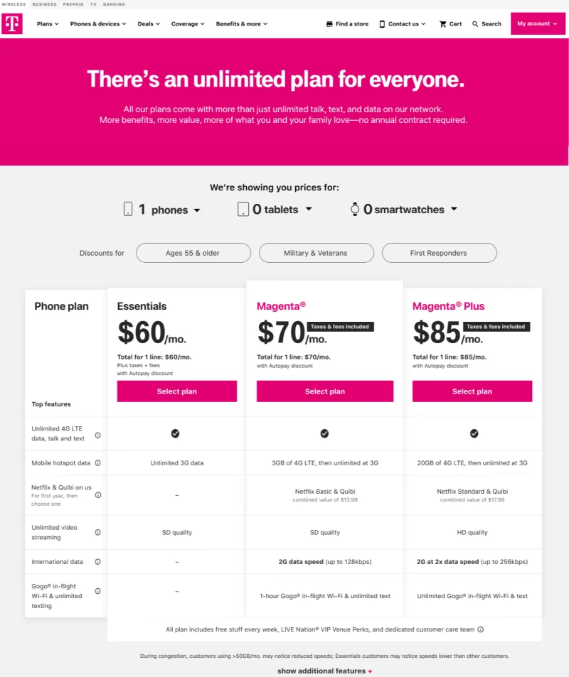
Increase confidence among prospects intimidated by switching carriers by making eligibility, number transfer, trade-in, coverage, and store/support paths easier to understand.

Role
Senior UX Designer
Constraint
Prospects struggled with switching steps, total cost, eligibility, content transfer, trade-in value, and disjointed handoffs between web, chat, store, and care.
Outcome
Moved the How to Switch experience toward clearer, more scannable guidance and stronger continuity across web, chat, store, and care.

Project context

my role

Senior UX Designer

client

T-Mobile

team

  • Cross-functional UX
  • product
  • and engineering collaboration

tools used

  • Keynote
  • Photoshop
  • Axure RP
  • Sketch
  • Zeplin
  • InVision

platform

Cross-platform product experience

Why it mattered

Story

Hypothesis

If switching guidance answered top questions inline and kept users in context, more prospects would understand the process and feel confident enough to continue.

Insights

Usability evidence surfaced discoverability, discount discovery, pricing comprehension, plan comparison, scrolling, and confidence-continuing-online issues across the purchase journey.

CASE STORY

Flows

Each lane isolates the clearest evidence so reviewers can scan the work in order.

01

Context · Background and constraints

Conversational Support

4 frames

02

Wireframes · Structure and flow logic

Switching + Purchase Architecture

3 shown · +3 more

CASE EVIDENCE

Deliverables

CONTEXT

Conversational Support

4 assets flow

WIREFRAMES

Switching + Purchase Architecture

7 assets flow

How it moved

Decision points

  1. Direction Chosen path and rationale

    Work within T-Mobile web patterns while tightening switching guidance, plan comparison, merger/acquisition support, guided chat moments, and handoffs to store or support.

  2. Validation Testing and refinement

    Remote usability feedback, stakeholder review, heat maps, eye-tracking, and chat interaction critiques shaped clearer guidance, comparison points, and handoffs.

  3. Engineering Handoff, specs, implementation

    Delivery focused on corporate-ready flows, chat-to-store continuity, voice-to-message concepts, and content sequencing that could fit into existing T-Mobile systems.

Resulting shift

What changed

  1. viewed switching carriers as a hassle 69%
  2. found switching too difficult or… 31%
  3. 15 participants preferred the jump-link… 11 of
  • Clarified switching steps, eligibility checks, and trade-in guidance
  • Validated jump-link navigation as a preferred direction
  • Strengthened web, chat, store, and care handoffs
  • Kept the design inside existing T-Mobile web and brand constraints

Tools

Tools used on project

The working set used to research, prototype, align, and ship this case.

  • Keynote
  • Photoshop
  • Axure RP
  • Sketch
  • Zeplin
  • InVision
  • Microsoft Office

Downloads

Downloads

Project files, specs, decks, and readouts available for download.

Worked with the following clients